
Role
Graphic Designer / Brand Designer — concept, identity system, visual applications and print adaptation.
Project goal
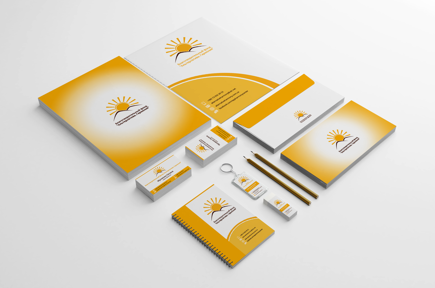
A corporate identity for “Alternative Harmony” built around a stylised sun motif and a warm yellow-orange palette. The symbol was developed to feel optimistic and approachable while remaining simple enough to work across a broad set of printed applications. The objective was to build a recognisable identity that could survive real everyday use, not only look convincing in a presentation mock-up.
Creative and technical approach
The identity extends through stationery, cards and promotional materials using consistent proportions, typography and colour. The result is a coherent system in which the logo does not stand alone but becomes the organising element for the whole visual language.
The identity was designed to work beyond the logo itself. Proportions, colour, typography and supporting elements were considered as one system that could move consistently between small-format stationery and larger communication pieces.
Result
A practical brand system that can move from logo to everyday communication without losing consistency. The result is distinctive enough to be recognisable, but restrained enough to remain usable across different formats and touchpoints.