
Role
Graphic Designer / Brand Designer — concept, identity system, visual applications and print adaptation.
Project goal
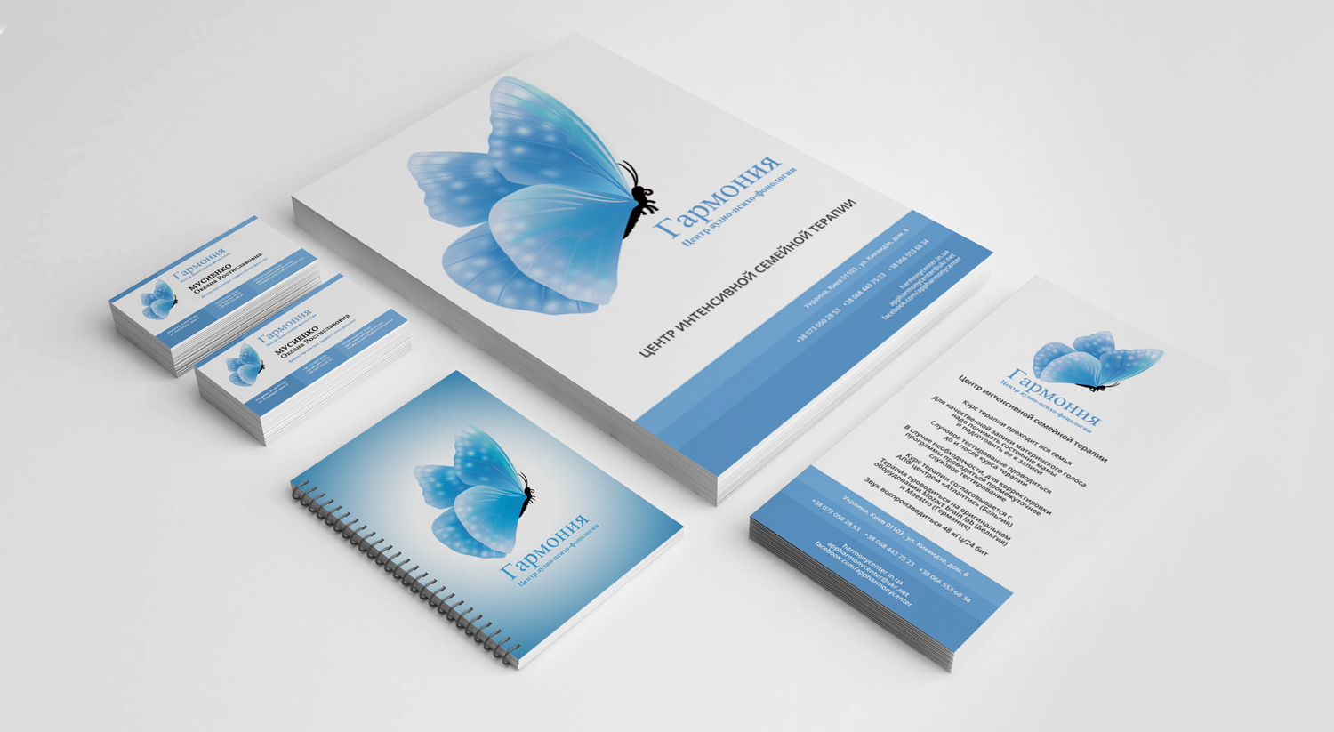
A corporate visual system for “Harmony” extending from stationery and printed communication to larger promotional formats. A light blue palette, delicate organic imagery and restrained typography give the identity a calm, professional character. The objective was to build a recognisable identity that could survive real everyday use, not only look convincing in a presentation mock-up.
Creative and technical approach
The project demonstrates how the same visual language can scale across very different applications. Logo placement, spacing and colour remain consistent while each format adapts to its own information needs, creating a connected family of materials rather than a set of isolated designs.
The identity was designed to work beyond the logo itself. Proportions, colour, typography and supporting elements were considered as one system that could move consistently between small-format stationery and larger communication pieces.
Result
A practical brand system that can move from logo to everyday communication without losing consistency. The result is distinctive enough to be recognisable, but restrained enough to remain usable across different formats and touchpoints.